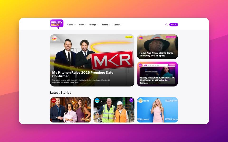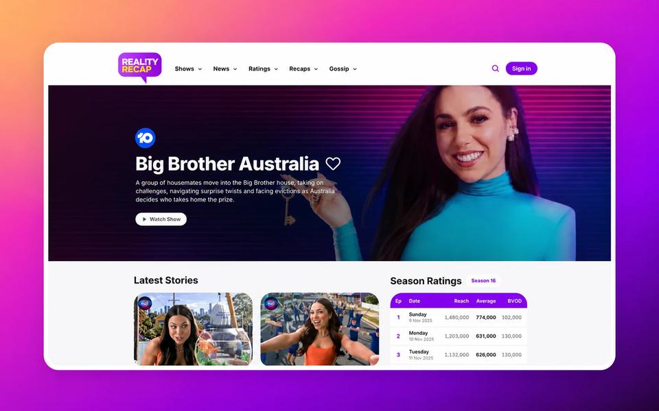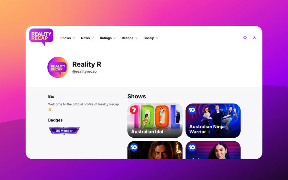
The biggest change is on the homepage, where article previews now use the standard card layout on mobile instead of the larger featured article format. It should make the latest stories easier to scan, tap and read on smaller screens.
A Smoother Mobile Menu And Search
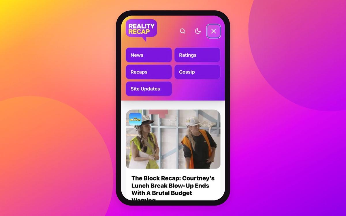
The mobile header has had a proper polish pass, with larger nav icons, a bigger logo, improved spacing and smoother menu interactions.
The menu now opens with a softer animation, while the category buttons appear with a staggered effect. The gradient background also extends down behind the menu, keeping the header feeling more connected instead of switching into a separate white panel.
Search has had the same treatment. The search bar now appears below the header, pushes the page content down properly and opens with a smoother animation. The search button also now uses the main Reality Recap purple, matching the category buttons in the mobile menu.
Cleaner Article Pages
Article pages have also had a few readability tweaks. The mobile back button now sits in the top right corner, article spacing has been tightened, and the gap between paragraphs and H2 headings has been reduced so sections feel less disconnected.
Article excerpts now preserve rich formatting from the opening paragraph too, so linked show names display properly with their intended bold and underlined styling.
More Shows Covered
Reality Recap has also added coverage for two more shows: My Kitchen Rules and The Golden Bachelor Australia.
That means future news, ratings, recaps and gossip around both shows can now be covered properly across the site.
As always, more updates are already in the works.