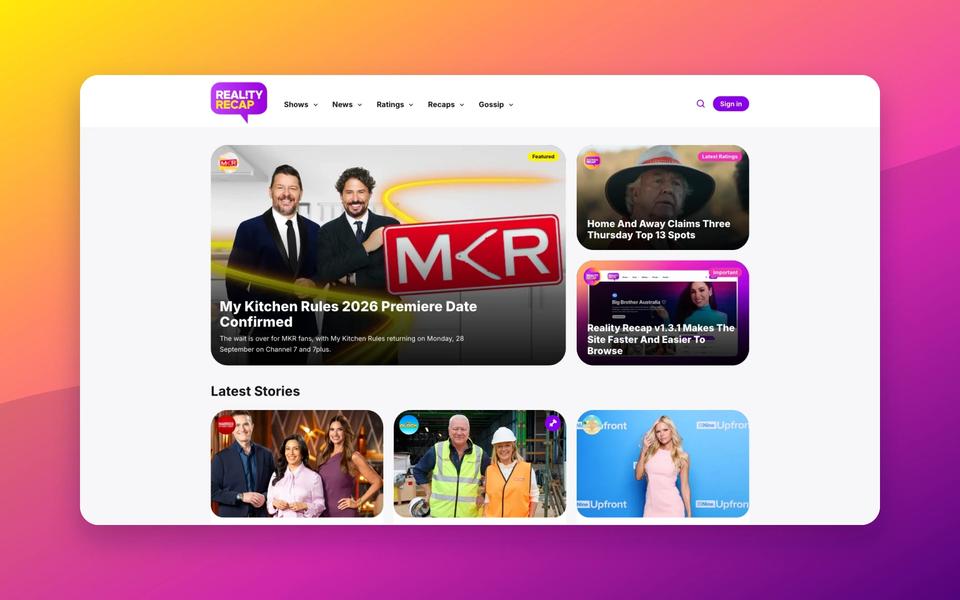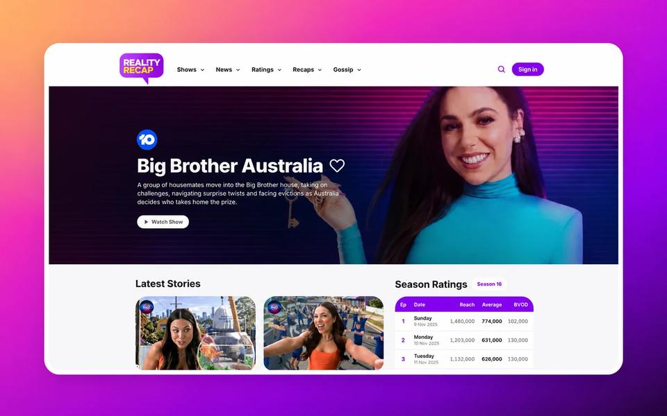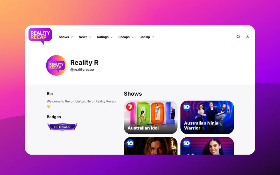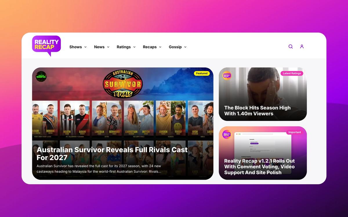
Reality Recap now feels sharper across the homepage, articles, show hubs, profiles, and account settings, with a stronger visual direction built around the site’s purple branding.
A Cleaner Reality Recap
The first thing readers should notice is the refreshed look. The site now uses a new font for a cleaner editorial feel, with updated headline sizes, lighter metadata, softer cards and more consistent rounded corners inspired by the Reality Recap logo.
Article previews have also been refined, with stronger headlines, cleaner date styling, calendar icons and tighter metadata spacing. The homepage has been reworked around one main featured story, the latest ratings article and an important site update, followed by the latest stories.
The header has been simplified too. The public light and dark mode toggle has been removed from the main navigation to keep the site feeling cleaner, but theme controls are still available for members through their account settings.
Smarter Show Page Filters
Show coverage has expanded, with Australian Ninja Warrior, The Amazing Race Australia and Dancing With The Stars Australia now added to Reality Recap’s covered shows.
The Shows page also has new network filters for Ten, Seven and Nine. If readers use the View All button from a network section in the Shows dropdown, the Shows page now opens with that network filter already applied, while still letting readers remove the filter and browse everything.
Show cards have been tightened up across mobile and desktop, with landscape cards on mobile and poster-style cards on larger screens. Airing Now and Coming Soon labels have also been restyled to better match the rest of the site.
Individual show hubs have had a broader polish pass as well. The hero sections, Watch Show buttons, Next Episode panels, contestants sections, ratings tables and latest stories grids have all been brought closer to the refreshed Reality Recap style. Pinned stories now appear at the top of a show’s latest stories, with a pin icon on the article preview image.
Better Articles
Article pages also have a cleaner back button, refreshed comments, improved correction forms, updated ratings tables and better list styling for bullet points and numbered lists.
Member Profiles And Settings Feel More Finished
Member areas have received a major tidy-up. Public profile pages now have cleaner typography, refreshed badges, tighter followed-show cards and a simpler layout that puts recent comments below the shows section.
The account settings page has also been redesigned with softer panels, cleaner forms and stronger purple action buttons. Members can manage profile details, website preferences and account deletion requests in a layout that now feels much more connected to the rest of the site.
Reality Recap has also added redesigned Member and OG Member badges. The first 500 members receive an OG Member badge, while later signups receive the standard Member badge.
A Faster Foundation
The update includes further performance improvements too, helping Reality Recap feel smoother and more reliable as the site continues to grow.
It is the kind of update that touches almost every corner of the site. Some changes are big and obvious, like the homepage and show hubs. Others are smaller details, like button spacing, dropdown animation, footer text and mobile article layout.
Together, they make Reality Recap feel more consistent, easier to browse and better prepared for the next stage of the site.
Reality Recap v1.3 is out now. Thanks for reading, following along and helping shape what the site becomes next.