Start Your Own Show Discussion
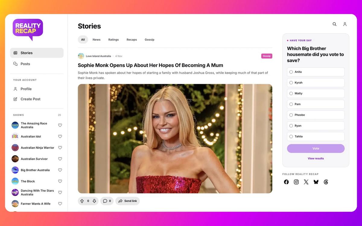
Member posts are the biggest new addition, giving fans a place to start their own discussions alongside the comments already available on articles.
Whether it is a prediction, a question about an episode or an opinion you want to share, clicking Create Post opens a pop-up where you choose a show, add a title and write your message.
Posts appear in the homepage’s Posts feed, the relevant show hub and the author’s profile. Anyone can read them, while posting and replying require a member account. When creating a post, please be sure to follow our Community Guidelines.
Filtering posts by Latest shows the newest posts first, while Popular ranks discussions using votes from the past seven days. Older posts can rise again when people vote on them recently, and the score displayed on each post remains its all-time total.
Members can reply to posts, vote on posts and replies, and sort replies by Top or Latest. Reporting and deleting your own posts or replies are available through the three-dot menu.
Have Your Say In Reader Polls
Reader polls add a quick way to join in without creating an account. Choose an answer or view the combined results, with the option to change your vote while the poll is open.
The opening question is: “Which Big Brother housemate did you vote to save?” This is a reader survey about your choice, and gives us an idea about how the show’s official voting may be stacking up.
Vote On Articles And Share Stories
Members can now upvote or downvote an article itself, extending voting beyond individual comments. The controls appear beneath story previews and at the end of articles, alongside the comment count.
The new Send Link button copies the article’s address to your clipboard, ready to paste into a message or share elsewhere. It appears on previews and full articles, with the shorter Link label on phones.
The existing comments and correction form have been restyled to match, and the Continue Reading section has been removed. The end of a story now leads into its reactions and conversation.
A New Layout Across The Website
The redesign replaces the old header and footer with a left sidebar, bringing Stories, Posts, account links and shows into one navigation area. While Casting, Site Updates and the information and legal pages sit under Resources.
The homepage’s featured sections make way for a scrolling Stories feed, with News, Ratings, Recaps and Gossip filters. Category labels use a new colour palette.
On phones and tablets, Stories, Posts, Shows and Poll have their own homepage tabs, while the hamburger menu opens the navigation.
Search results, account pages and public profiles also follow the new design. Profiles separate posts from existing article comments, with favourite shows moved to the right sidebar on desktop and a Favourites tab on smaller screens.
Show Hubs And Ratings Tables Get A Refresh
The redesigned show hubs separate Stories, Posts and Ratings into tabs. Show artwork spans the main page area, and contestants move into their own tab on phones to leave more room for the selected content.
MKR’s score breakdowns have a more compact pop-up, with restyled points and round controls.
Ratings tables have also been redesigned with neutral headers and tighter spacing. In ratings articles, choosing a sort option brings that column into view, so the selected figures are easier to find on a smaller screen.
A Few Useful Fixes
Casting now picks up stories already tagged for that section, including older announcements that were being missed. Spacing around article actions and comments has been tightened.
Links in the mobile profile menu have also been fixed, so Profile and Settings open correctly. The Privacy Policy and other resource pages have been updated to explain the new posts and polls.
If anything looks out of place as you explore the update, please let us know using the Report error button at the end of this article.